


When it comes to effective communication; whether it’s in marketing, sales, or even just day-to-day writing; one small detail can make a big difference: the call to action. You’ve probably seen CTAs everywhere, from bold “Buy Now” buttons to subtle “Learn More” links at the end of a post.
But what exactly makes a call to action work? Why are they so essential for engagement and conversions?
In this post, we’ll break down what a call to action actually is, where and how to use one, and what separates an effective CTA from one that frankly just gets ignored. If you’re looking to guide your audience more clearly and encourage them to take that next step, read on!

What is a call to action?
A call to action, often shortened to CTA, is a prompt that encourages someone to take a specific step. It could be as simple as “Subscribe Now” at the end of a newsletter or as persuasive as “Start Your Free Trial” on a product page.
These prompts guide your audience toward the outcome you want; whether that’s making a purchase, signing up, downloading content, or getting in touch.
Think of a CTA as a signpost in your content. Without it, your audience may be unsure about what to do next or how to engage further. A well-crafted CTA removes that uncertainty and makes the next move feel easy and natural.
CTAs appear everywhere: websites, emails, social media, blog posts, digital ads, within SaaS products, even in transactional emails and podcasts. Wherever there’s an opportunity to inspire action, there’s a place for a CTA.
Why are calls to action important?
Calls to action aren’t just nice-to-have elements; they play a key role in guiding your audience and helping your content achieve its purpose. Without a CTA, readers might enjoy your message but leave without doing anything more.
A strong CTA gives them that gentle nudge to take the next step, whether it’s making a decision, exploring your offer, or starting a conversation.
They also serve as milestones in the user journey. By encouraging action at the right moment, CTAs help move people through your funnel; turning a casual browser into an email subscriber, a subscriber into a customer, and a customer into a loyal supporter.
For marketers, business owners, and creatives alike, CTAs bring structure to your content and results to your strategy. The right words, placed at the right time, can make the difference between interest and engagement.
Call to action example: Foodbank
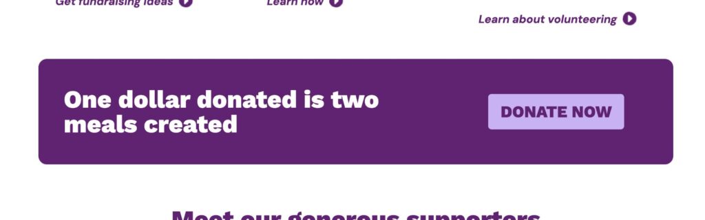
Australian charity Foodbank has a great CTA banner on their homepage. The messaging is large and simple, with a clear donate now button.
Types of calls to action
Not all CTAs serve the same purpose, and knowing which type to use can make your content more effective. Some CTAs are designed to drive sales, while others aim to educate, engage, or simply open a line of communication. Here are a few common types of CTA that you might come across.
Transactional CTAs
These are focused on encouraging a purchase or sign-up. Think “Buy Now,” “Start Your Free Trial,” or “Book a Call.” They’re direct and geared toward conversion.
Informational CTAs
These invite the reader to explore more. Phrases like “Learn More,” “Read the Full Guide,” or “Watch the Demo” work well when your goal is to educate or offer additional value.
Engagement CTAs
Perfect for content that aims to build relationships or spark conversation. Examples include “Leave a Comment,” “Share This Post,” or “Follow Us.”
Contextual CTAs
These are tailored to your audience or the stage they’re at in their journey. For instance, a returning visitor might see “Welcome Back; Explore What’s New,” while a first-time visitor might be prompted with “Discover How We Can Help.”
Choosing the right type of CTA depends on your goal and the context in which it appears. The more aligned it is with your audience’s needs and mindset, the better the results.
Where should you place a call to action?
A great CTA is only effective if people actually see it; so placement matters just as much as wording. Where you put your call to action can influence whether someone takes the next step or simply scrolls past.
On websites, CTAs often work well at the end of landing pages, in the middle of blog posts, or as floating buttons that follow the visitor as they browse.
If you’re sending out emails to your email list, position your CTA where it feels natural; after a compelling paragraph, beneath a product highlight, or as a button that stands out visually. For social media, keep it short and sweet, and make sure your message is clear even if someone is quickly scrolling through.
You can also use CTAs inside apps, at the end of videos, or during webinars; anywhere your audience might be ready to take action. The key is to place them where they align with the user’s mindset and intent.
Good placement feels like the next logical step, not a jarring interruption. It should support your message and make it easy for someone to move forward.
Call to action example: Modcloth
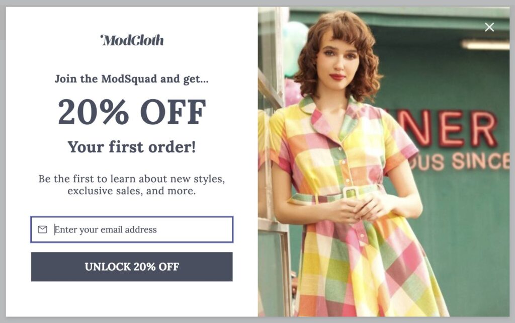
Popular clothing online retailer, Modcloth, has a great popup to capture email addresses. Rather than a simple ‘subscribe’ button, this button states ‘Unlock 20% off’ which is bound to result in much higher subscribe rates.
What makes a call to action work?
A well-placed CTA is only part of the puzzle. For it to truly land, it needs to be clear, purposeful, and appealing enough to spark action. A vague message like “Click Here” doesn’t offer much incentive. A great CTA, on the other hand, tells your audience exactly what to do and why it’s worth their while.
Start with clarity. Use direct, action-oriented language that leaves no room for confusion. Words like “Get,” “Try,” “Start,” or “Download” help set expectations and create a sense of momentum.
Design plays a key role, too. Make your CTA stand out with a strong contrast in color, a readable font, and enough white space around it to draw attention. Whether it’s a button, link, or banner, it should feel natural in your layout but still catch the eye.
You can also create urgency by adding time-sensitive language like “Limited Offer” or “Register Today.” Just make sure the urgency feels genuine rather than forced.
Finally, keep your ideal audience in mind. A CTA that works well for a first-time visitor may need tweaking for a returning user or a loyal subscriber. The more relevant it feels to where someone is in their journey, the more likely they are to act on it.
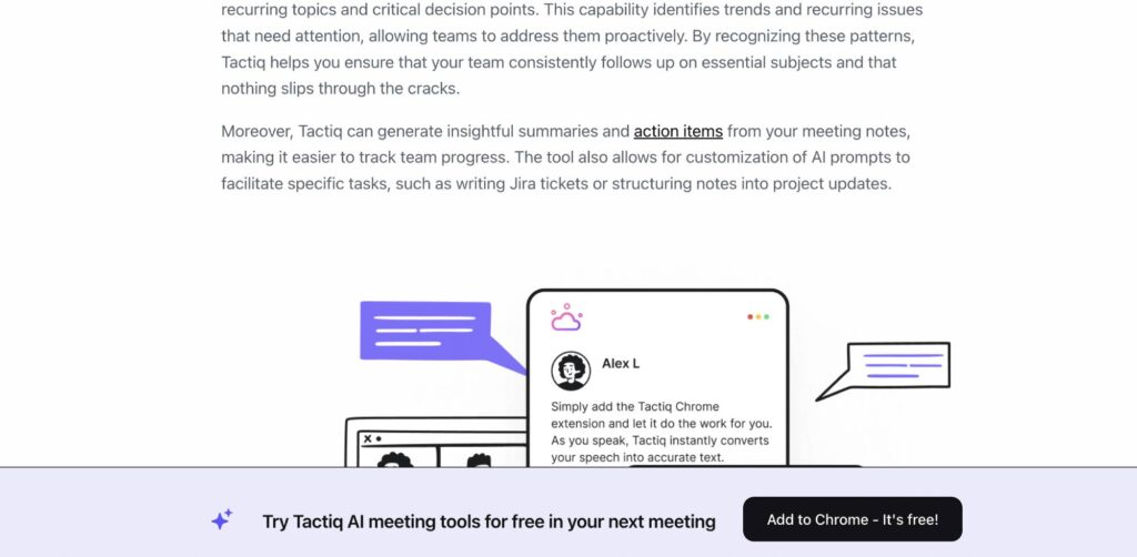
Australian SaaS product Tactiq have a great blog which features a few calls to action, including this persistent pop up at the bottom.
Common CTA mistakes to avoid
Even the best content can fall flat if the call to action misses the mark. Knowing what not to do is just as important as crafting a compelling message. Here are a few common missteps to watch for.
Being too vague
If your CTA is unclear or generic; like “Click here”; it won’t inspire much confidence or curiosity. People respond better to specific, benefit-driven language.
Crowding the page
Multiple CTAs competing for attention can create confusion and decision fatigue. Stick to one clear goal per section, and guide your audience gently toward it.
Poor visibility
A CTA that blends into the background or appears too far down the page might never get noticed. Use thoughtful design and placement to make it easy to spot without feeling pushy.
Mismatch in message and action
Make sure your CTA aligns with the content that surrounds it. If your article promises helpful advice and the button says “Buy Now,” your audience may hesitate. Keep it consistent and intuitive.
Being mindful of these common issues can help your calls to action feel more trustworthy, relevant, and effective.
Call to action example: Linktree
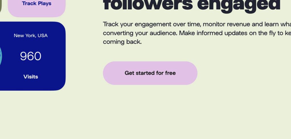
Australian link in bio provider Linktree have a simple button message ‘Get started for free’. This reduces expected hurdles, and encourages more people to convert to signing up.
How to test and improve your CTAs
Creating a solid call to action is a great start, but the real magic often comes from ongoing testing and refinement. Just like the rest of your content, CTAs benefit from a little experimentation to see what truly clicks with your audience.
Start by testing different versions of your CTA text. A small change in wording; like switching “Get Started” to “Start My Free Trial”; can impact how people respond. Try experimenting with colour, placement, or button size as well. These visual tweaks can make a big difference in visibility and engagement.
A/B testing is one of the most reliable ways to measure what works. Show different versions to different segments of your audience and track which version performs better. Many website and email tools include built-in testing features to help with this.
Here’s a handy list of common elements to test when optimising a call to action (CTA), especially if you’re aiming to improve engagement and conversions:
Button text
Try different wording styles—action-based (“Get Started”), benefit-focused (“Save My Seat”), or personalised (“Show Me My Plan”).
Colour and contrast
Experiment with colour combinations that stand out from the surrounding design while still aligning with your brand.
Placement on the page
Test CTAs above the fold, midway through content, or at the end to see where your audience is most likely to engage.
Size and shape
A larger button might draw attention, but subtle adjustments to padding or rounded corners can also impact clicks.
Design and icons
Adding visual elements like arrows or icons can increase clarity and reinforce action.
Use of urgency
Test time-sensitive phrases like “Register Now” or “Offer Ends Soon” to create a gentle sense of urgency.
Supporting text
Include or remove a brief line under your CTA to reinforce the benefit or offer.
First-person vs. second-person
Try “Start My Free Trial” vs. “Start Your Free Trial” to see which tone resonates more with your audience.
Surrounding content
Test different headlines, product descriptions, or testimonial placements near the CTA to boost credibility and appeal.
Always remember that improvement doesn’t have to be dramatic. Just like when optimising a blog post, small, thoughtful updates over time can lead to stronger performance and more confident actions from your audience.
Measure the results!
Once your call to action is live, the real work begins. Testing and tweaking are vital, but none of it matters without measurement. One of the most important benefits of taking a strategic approach to CTAs is the ability to back up your choices with data, not just hunches.
As with any optimisation work, you should dive into your analytics dashboard and pay close attention to key performance indicators like click-through rates (CTR), conversion rates, time on page, and bounce rates.
These numbers reveal how your audience is engaging with your CTA: Are they clicking the button? Are they taking the next step? Or are they dropping off without action?
You can go deeper by comparing how different versions of a CTA perform across channels or devices. For example, does “Get My Free Guide” work better in a mobile email than on your homepage? Are users more responsive to buttons in the middle of your blog posts versus the end?
Heatmaps and scroll-tracking tools can also be helpful. They show how far users get down the page and where they’re spending time. These are valuable clues for optimising placement and design of CTA buttons and text.
Remember, there’s no universal right answer. Success depends on your audience, your precise offering, and your goals. But by consistently measuring performance and adapting based on real data, your CTAs won’t just feel better; they’ll work better.
Because in the end, numbers don’t lie.
Call to action example: Zeller
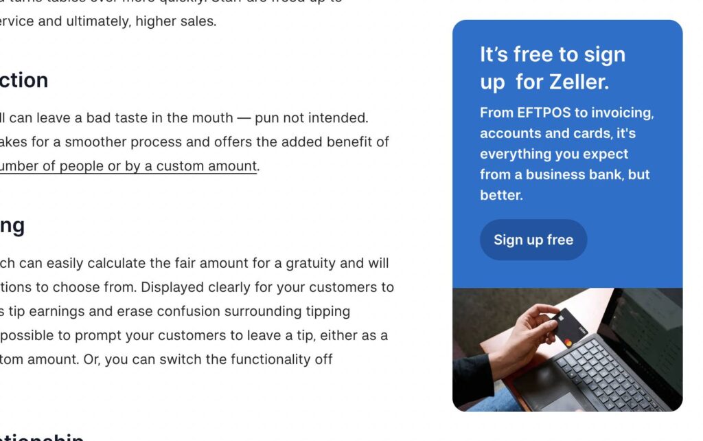
Australian EFTPOS software, Zeller, have a great blog with a clear side panel encouraging signups using various headings, depending on which blog category you are reading.
Conclusion
A well-crafted call to action is more than just a few words at the end of a message. It’s a bridge between your content and the next step you want your audience to take. Whether you’re encouraging a sign-up, a sale, or simply a deeper connection, a thoughtful CTA helps guide the journey and create momentum.
By understanding what makes CTAs effective, avoiding common mistakes, and taking the time to test and improve, you can turn passive readers into active participants. It’s all about clarity, timing, and creating a sense of value in that next click or tap.
If you haven’t reviewed your CTAs in a while, now’s a great time to take a closer look. Small changes can lead to big improvements.