


If you’re running an online business or website, you are pretty likely to have heard the term “conversion”, however maybe you don’t really understand it all. In simple terms, conversion refers to the percentage of visitors to your site who take a desired action, such as making a purchase or filling out a form.
When you optimise for better conversion rates, what you are doing is making small but significant changes to your website to increase the number of people who take that desired action.
So, how can you optimise for better conversion rates? There are a number of strategies you can use, but here are some of the most effective:
- Understand your audience
- Make your website easy to navigate
- Use clear, compelling language
- Offer social proof
- Make it easy to convert
- Have a fantastic call to action
- Focus on benefits not features
- Test and iterate
Let’s now go through each one of these, in more detail.
Understand your audience
The first step when starting to optimise for better conversion rates, is to focus on understanding your audience. Who are they? What are their needs and pain points? What motivates them to take action?
You need to create specific, detailed ideal customer personas, so you know what to focus on. The better you understand your audience, the better you can tailor your messaging and offerings to their specific needs.
Make your website easy to navigate
When visitors come to your website, they should be able to find what they’re looking for quickly and easily. This means having a clear navigation menu, prominent calls-to-action, and a layout that is easy to understand.
Navigation is the backbone of your website, and it’s the first thing visitors use to get around your site. If your navigation is confusing, hard to use, or doesn’t make sense, your visitors will leave and never come back. Here are some tips on how to improve website navigation.
Keep it simple
The first rule of website navigation is to keep it simple. Don’t overwhelm your visitors with too many options. Stick to the essentials and make it easy for them to find what they’re looking for.
Use clear, concise labels for each section, and avoid using industry jargon or overly complicated language.
Use a logical structure
Your website navigation should follow a logical structure that makes sense to your visitors. Group similar pages together and organise them in a way that’s intuitive. For example, if you have an e-commerce site, group all your product categories together under a “Shop” or “Products” tab.
Use submenus
Using submenus is a great way to provide more options without cluttering up your navigation menu.
This allows visitors to drill down into specific subcategories, making it easier for them to find what they’re looking for. However, be careful not to make these menus difficult, as they can become overwhelming and confusing.
Include a search facility
Even the best navigation can’t anticipate every visitor’s needs. That’s why it’s important to include search on your website. This allows visitors to quickly search for what they’re looking for, bypassing the navigation altogether if they choose.
Test and refine
Improving website navigation is an ongoing process. You should regularly test your navigation and make changes based on user feedback. Use tools like heat maps and user testing to see where visitors are getting stuck or confused, and make changes accordingly.
Use clear, compelling language
If you are trying to optimise for better conversion rates, then you have to use clear, compelling language to entice your website visitors. Your website copy should be clear and easy to understand, with a focus on benefits rather than features. Use strong, action-oriented language to encourage visitors to take action.
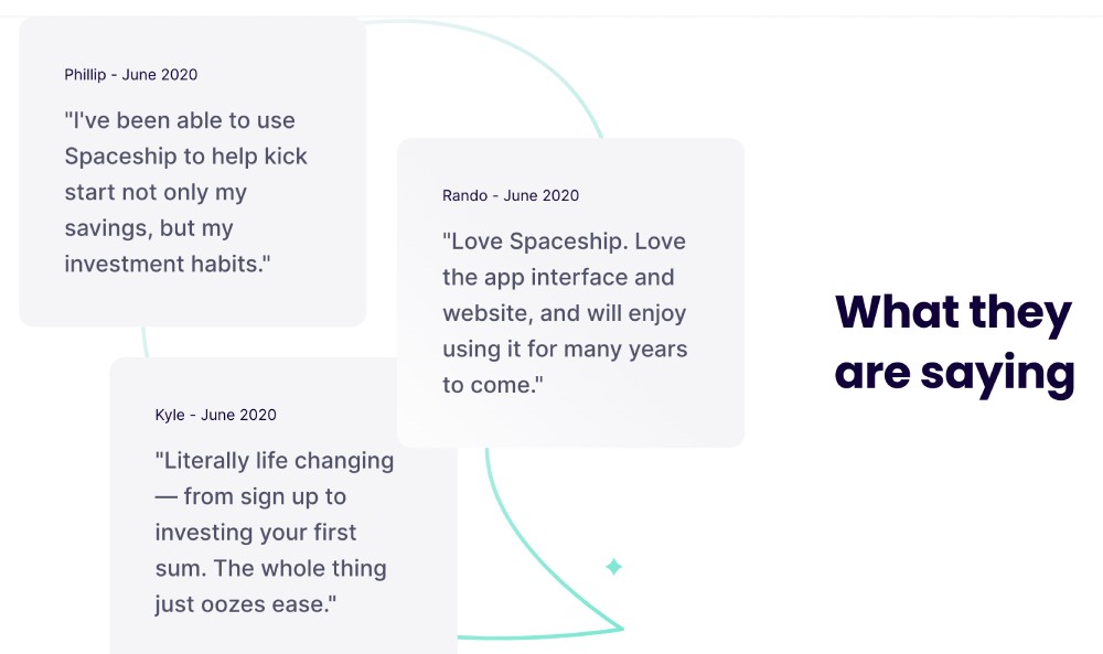
Offer social proof
People are more likely to take action when they see that others have done the same. Use social proof, such as customer testimonials or reviews, to show that your product or service is trusted by others.
If you’ve ever purchased a product or used a service because a friend recommended it, you’ve experienced social proof. Social proof is a powerful psychological phenomenon that occurs when people assume that the actions of others reflect correct behaviour for a given situation. In other words, people tend to follow the crowd.
Social proof is a popular marketing tool that businesses use to influence customer behaviour. By showing that others have already used and enjoyed their product or service, businesses can build trust and increase sales.
Here are some examples of social proof:
Customer reviews and testimonials
One of the most common forms of social proof is customer reviews and testimonials. When potential customers see positive reviews from other customers, it can increase their trust in the product or service. For example, a restaurant may display positive reviews from satisfied customers on their website or social media pages.
Social media likes and shares
Social media likes and shares can also serve as social proof. When people see that a post has a high number of likes and shares, they are more likely to view it as valuable or interesting. For example, a clothing brand may share a photo on Instagram of a customer wearing their clothes and receive many likes and shares from followers.
Influencer endorsements
Influencer endorsements are another form of social proof. When an influencer with a large following recommends a product or service, their followers may be more likely to purchase it. For example, a beauty brand may partner with a popular makeup artist on Instagram to promote their new line of products.
Social media followers
The number of social media followers a business or brand has can also serve as social proof. When people see that a business has a large following, they may assume that the business is popular and trustworthy. For example, a travel blogger with a large following on Instagram may be approached by a hotel chain for a partnership because of their social proof.
Awards and recognition
Awards and recognition can also serve as social proof. When a business wins an award or receives recognition from a reputable organisation, it can increase their credibility and influence customer behaviour. For example, a software company may display a badge on their website that they won a prestigious industry award.
By using social proof in your marketing strategy, you can show potential customers that others have already used and enjoyed your product or service, making them more likely to do the same.
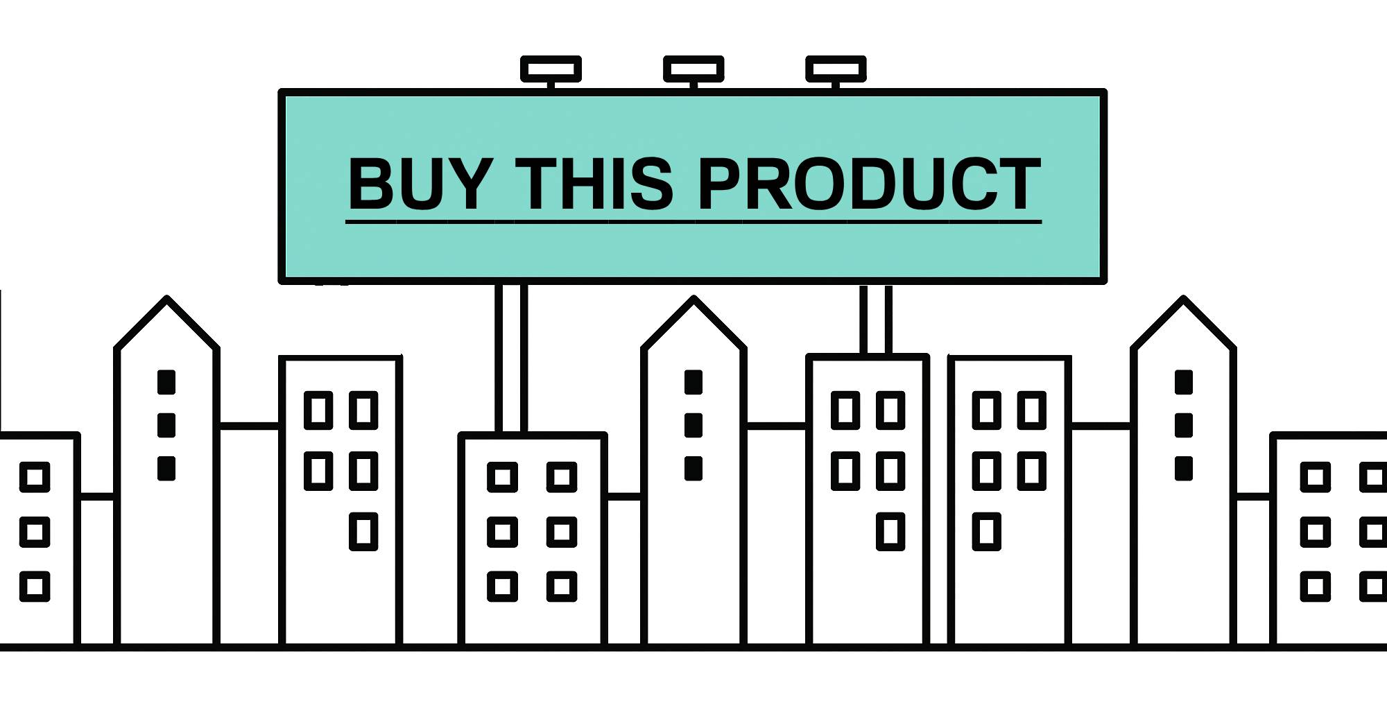
Make it easy to convert
If you are trying to optimise for better conversion rates, then you must focus on making it as easy as possible for your website visitors to take whatever desired action you have set out for them.
This means you should be reducing friction wherever possible, such as by simplifying the checkout process or reducing the number of form fields. Anything absolutely not required to be collected in a form should be thrown out.
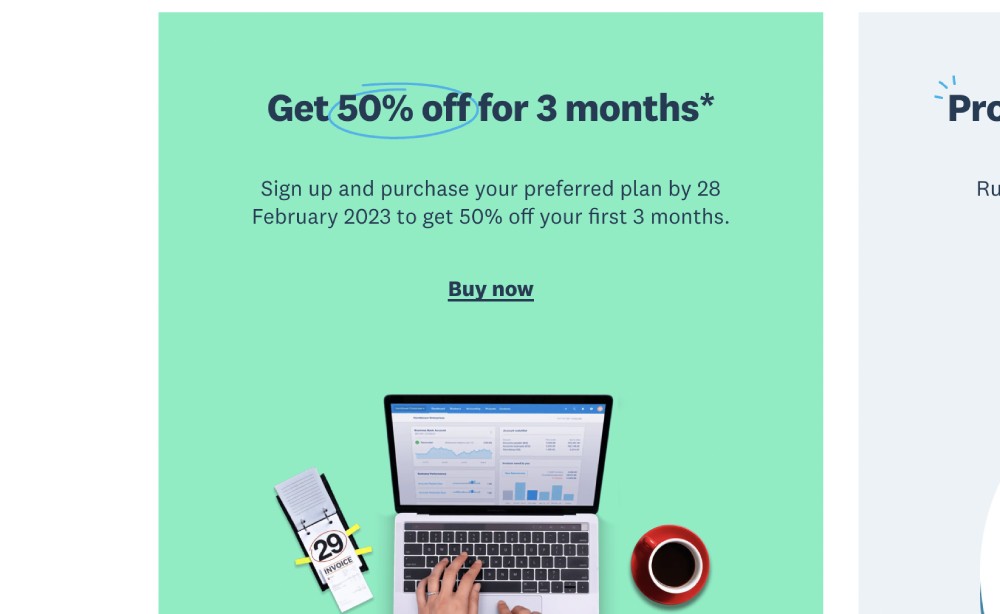
Have a fantastic call to action
If you’re running a business or a website, you probably know the importance of having a call to action (CTA) on your website. A call to action is a prompt that encourages your visitors to take a specific action, such as signing up for a newsletter or purchasing a product.
Writing a great call to action is essential to converting visitors into customers. Here are some tips to help you create a strong CTA:
Be clear and specific
Your call to action should be clear and specific about the action you want your visitors to take. Avoid vague language and be explicit about what you want them to do. For example, instead of saying “Learn More,” try “Sign Up for Our Free Webinar.”
Use action-oriented language
Your call to action should use action-oriented language that inspires visitors to take action. Use verbs that create a sense of urgency and motivate people to act, such as “Join Now,” “Get Started,” or “Buy Today.”
Create a sense of urgency
Creating a sense of urgency can help motivate visitors to take action. Use words that convey a sense of urgency, such as “Limited Time Offer” or “Act Now” to encourage visitors to take action before it’s too late.
Be visually prominent
Your call to action should be visually prominent on your website. Use contrasting colours, bold text, and buttons to make it stand out from the rest of your content. It should be easily identifiable and easily accessible to visitors.
Offer value
Your call to action should offer value to your visitors. This could be in the form of a discount, a free trial, or access to exclusive content. Make sure your CTA clearly communicates the value that visitors will receive by taking the desired action.
Test and iterate
Creating a great call to action is an iterative process. You should be constantly testing and tweaking different elements of your CTA to see what works best. Use tools like A/B testing to compare different versions of your CTA and see which one performs better.
Focus on benefits not features
When it comes to marketing, it’s easy to get caught up in listing the features of your product or service. But the truth is, customers don’t buy features; they buy benefits. Benefits are the ways in which your product or service improves their lives. So, how do you write about benefits rather than features? Here are some tips to help you get started:
Focus on the problem you’re solving
When writing about your product or service, start by focusing on the problem you’re solving. What pain points does your product or service address? How does it make your customers’ lives easier or better? By highlighting the problem you’re solving, you can better communicate the benefits of your product or service.
Use customer-centric language
When writing about your product or service, use language that is customer-centric. Instead of focusing on what your product does, focus on what it does for your customers. For example, instead of saying “Our software has advanced features,” say “Our software makes your life easier by streamlining your workflow.”
Emphasise outcomes, not features When describing your product or service, focus on the outcomes that customers will experience, not the features that enable those outcomes. For example, instead of saying “Our vacuum has a powerful motor,” say “Our vacuum cleans your floors quickly and efficiently.”
Use storytelling
One of the most effective ways to communicate the benefits of your product or service is through storytelling. Share real-life stories of how your product or service has helped customers overcome a specific problem or achieve a desired outcome.
By using storytelling, you can make the benefits of your product or service more tangible and relatable.
Be specific
When describing the benefits of your product or service, be as specific as possible. Use concrete examples and data to illustrate the impact your product or service can have on your customers’ lives. For example, instead of saying “Our product can save you time,” say “Our product can save you 10 hours a week.”
Test and iterate
Optimising for conversion is an ongoing process, not a one-time event. You should be constantly testing and tweaking different elements of your website to see what works best. Use tools like A/B testing to compare different versions of your website and see which one performs better.
In today’s world, it’s more important than ever for businesses to stay ahead of the competition. A/B testing is a popular technique that businesses use to test and optimise their marketing strategies. But what exactly is A/B testing, and how can it benefit your business?
A/B testing, also known as split testing, is a method of comparing two different versions of a marketing asset to determine which one performs better. These assets can include emails, landing pages, ads, and even product packaging.
By randomly dividing your audience into two groups and presenting each group with a different version of the asset, you can compare the results and determine which version is more effective.
Here are some examples of A/B testing in action:
Email subject lines
A/B testing is commonly used to test different email subject lines. By creating two versions of an email with different subject lines and sending each version to a random sample of your email marketing list, you can determine which subject line performs better.
For example, a clothing brand may send one version of their email with the subject line “New arrivals just in!” and another version with the subject line “Shop now for our latest collection.”
Landing pages
A/B testing can also be used to test different versions of landing pages. By creating two versions of a landing page with different layouts, images, or call-to-actions and directing traffic to each page, you can determine which version performs better in terms of conversion rates. For example, a software company may create one landing page with a free trial offer and another with a 50% discount offer.
Advertising
A/B testing can be used to test different versions of ads. By creating two ads with different headlines, images, or copy and showing them to a random sample of your audience, you can determine which ad performs better.
For example, a car dealership may create one ad with an image of a car and the headline “New Year, New Ride” and another ad with an image of a happy family and the headline “Upgrade Your Family’s Ride.”
In Summary
By following these strategies, you can optimise for better conversion rates and increase the number of visitors who take the desired action. The eight areas I discussed above, again, are;
- Understand your audience
- Make your website easy to navigate
- Use clear, compelling language
- Offer social proof
- Make it easy to convert
- Have a fantastic call to action
- Focus on benefits not features
- Test and iterate
Remember, optimising for conversion is an ongoing process, so be prepared to continually test and refine your approach to achieve the best possible results. By doing so, you’ll keep visitors on your site longer, increase engagement, and ultimately drive more conversions.